La Isla - Juice Bar
Refreshing flavors for a vibrant community
Overview
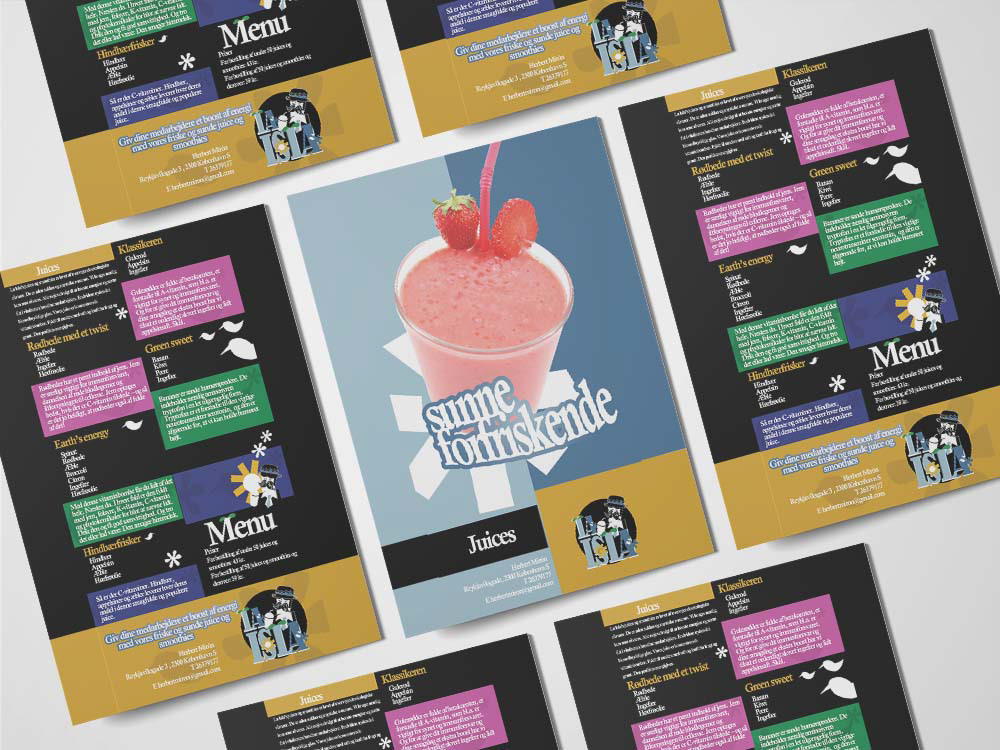
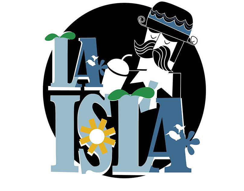
While working at 360 Graphic Studio, a full-service advertising agency, I was assigned to develop the brand identity for La Isla, a juice bar located in Belgium. The project began with a simple sketch provided by the client, which I transformed into a vibrant and cohesive visual identity that captured the essence of the brand.
The Process
01. Research & Mood boarding
I explored tropical motifs, fresh color palettes, fruit symbolism, and friendly typefaces. Inspiration was drawn from natural textures, juicy fruits, and playful shapes.
02. Concept Sketches & Logo Exploration
Based on the client’s original drawing, I developed logo concepts that balanced modern design with hand-drawn charm. I played with rounded typography and island-inspired iconography.
03. Color & Typography
I selected a bright, warm color palette—think mango, lime, and ocean blue—paired with a bold, rounded sans-serif font for readability and fun.
04. Brand Identity System
The final brand package included:
• Primary and secondary logos. Icon set and illustrations.
• Color and typography system.
• Print and digital mockups.
• Social media templates
Process Gallery
Contact Me

I am ready and excited to start your project.
Fill out the form — I'll beam back within a day.
I am ready and excited to start your project.
Fill out the form — I'll beam back within a day.
01 / 06